A new study by the U.S. Global Climate Research Program, as part of the National Climate Assessment, shows far-reaching impacts already occurring across the U.S. from climate change. This reports lays out current impacts in stark, clear terms. This report is based on the work of 300 scientists and 60 review panels.
The report states: “Summers are longer and hotter, and extended periods of unusual heat last longer than any living American has ever experienced… Winters are generally shorter and warmer. Rain comes in heavier downpours. People are seeing changes in the length and severity of seasonal allergies, the plant varieties that thrive in their gardens, and the kinds of birds they see in any particular month in their neighborhoods.”
Major points include:
— The draft report notes that average temperature in the US has increased by about 1.5F (0.8C) since 1895, with more than 80% of that rise since 1980. The last decade was the hottest on record in the US.
— Global climate is changing 10 times faster than natural rates.
— Parts of the country are getting wetter, other parts are getting drier. All areas are getting hotter reported US Geological Survey.
This report looks at ten datasets for indicators such as glacier melting, sea temperatures, sea level, snow cover and land temperature, among other things. This complex series of indicators all point to sustained, unmistakable climate change.
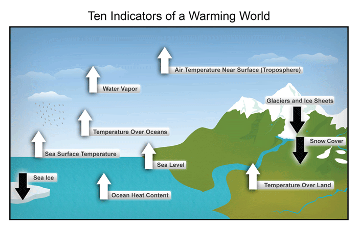
Source: National Climate Assessment. These are just some of the indicators measured globally over many decades that show that the Earth’s climate is warming. White arrows indicate increasing trends, and black arrows indicate decreasing trends. All the indicators expected to increase in a warming world are, in fact, increasing, and all those expected to decrease in a warming world are decreasing. (Figure source: NOAA NCDC based on data updated from Kennedy et al. 2010).
Some other key charts and datapoints from the study include drastic changes in rainfall intensity in the northeast U.S., sea level rise, and significant reduction in the number of frost free days, which means a longer growing season, and steadily warming land temperatures.
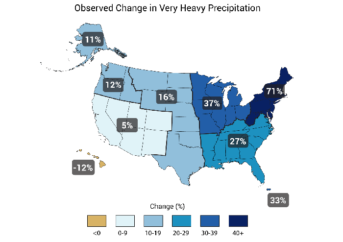
Source: National Climate Assessment. Sever rainstorms are becoming a fact of life in the northeast U.S.
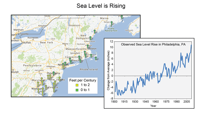
Source: National Climate Assessment. Sea level rise will become a major factor for the northeast U.S.
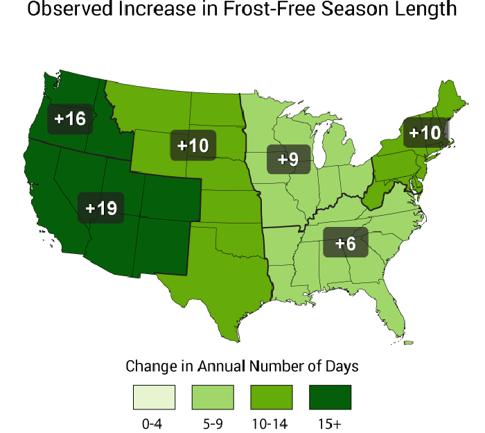
Source: National Climate Assessment. The frost-free season length, defined as the period between the last occurrence of 32°F in the spring and the first occurrence of 32°F in the fall, has increased in each U.S. region during 1991-2012 relative to 1901-1960. Increases in frost-free season length correspond to similar increases in growing season length.
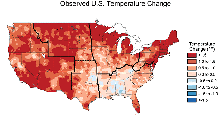
Source: National Climate Assessment. The colors on the map show temperature changes over the past 22 years (1991-2012) compared to the 1901-1960 average. The period from 2001 to 2012 was warmer than any previous decade in every region.
The climate change debate in the U.S. gets bogged down on the causes of climate change, with deniers stressing that human fossil fuel use is not the cause. This report provides the obligatory data that shows temperature increases due to human factors.
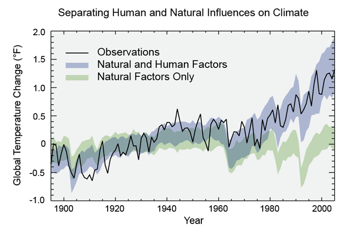
Source: National Climate Assessment. Observed global average changes (black line), model simulations using only changes in natural factors (solar and volcanic) in green, and model simulations with the addition of human-induced emissions (blue). Climate changes since 1950 cannot be explained by natural factors or variability, and can only be explained by human factors. (Figure source: adapted from Huber and Knutti).

