The US Census came out with its 2012 population estimates last week. Note that these are only estimates and  that these figures are not considered as credible as the decennial Census conducted at the end of every decade. Nevertheless, they are the best we have.
One thing that the US Census allows us to do in the Adirondack Park is to take an impartial look at Adirondack Park population trends through the lenses of what’s happening across the rest of New York as well as across the country. This allows us to step back from the controversies around Adirondack Park environmental controls, economic development, and political agendas, and look at larger population trends in rural America.
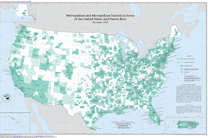
The US Census provides good data on areas it classifies “metropolitan” areas (regions dominated by large cities and suburbs; think the areas of the US like Chicago, New York City, Denver, Los Angeles, and many other similar places). It also tracks “micropolitan” areas, regions around small cities like Plattsburgh, Malone, and Utica, among lots of others. A huge swath of the rest of the US does not have the populations to meet these classifications. These are places like the Adirondacks, thoroughly rural with low populations. The map below shows metropolitan areas in dark green, micropolitan in lighter shades of green, and rural in white. The Adirondacks is largely white, with some micropolitan areas on its borders.
This map is interesting because it shows the vast areas of the US where rural demographic and economic patterns dominate. It’s also plain to see that there are huge swaths of the US dominated by major metropolitan areas or smaller micropolitan areas. Using this as a reference will be useful when we look at areas of the US where new growth is estimated.
Before we look at national trends, a look at New York and Adirondack towns is instructive. Note that the 2012 US Census estimates provides county level data. This is helpful in a generalized way, but fails to tell us the whole story. An analysis of the county-level data in 2010 found that the Adirondack Park was largely, outside of Hamilton County, holding its own on the population front, even as a number of counties in New York State experienced population losses.
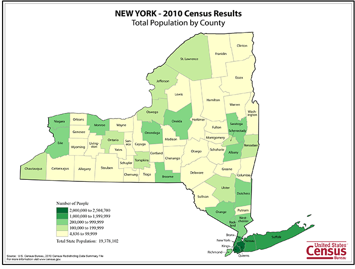
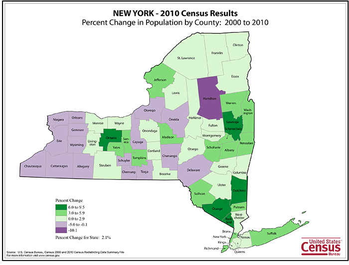
Here are two maps that show New York’s population in 2010 and New York’s population change 2000-2010, using county-level data.
What do these two maps show? Note that from 2000-2010, New York’s population grew by over 400,000, or a 2.1% rate compared with the overall US population that grew by around 9.7%. Here’s a good analysis by the Empire Center on New York’s growth 2000-2010. Population growth in New York, like population growth in the US, is not the same in all areas. In New York, areas like the Hudson Valley grew by over 5% and the Capitol District grew by 4.8%. Other areas, like western New York, saw a 3% population loss. The North Country, which encompasses the Adirondack Park, grew by just 1.7% and New York City grew by 2%. Upstate overall grew by 1.5% and downstate grew by 2.5%.
The map shows that all counties south of the Catskills saw growth while population loss was varied in central New York and almost all counties in western New York lost population.
In the Adirondacks, note that most counties saw population growth. Yet, Hamilton County experienced the most dramatic loss in the state. What’s going on in Hamilton County bears a closer examination.
But, of course, county-level data doesn’t tell us the whole story about what’s going on in the Adirondack Park. Only Hamilton and Essex counties are completely within the Blue Line and past research has shown differences for population trends for towns in the Park’s interior and towns that are on the edge of the Park and often split by the Blue Line.
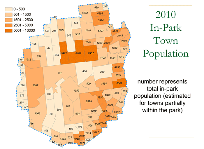
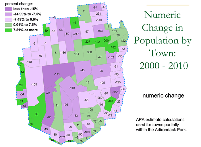
Thankfully, the APA has probed this further with its excellent GIS staff. They have a good town-by-town analysis of the Park’s population changes 2000-2010. Here are two maps from this dataset that show the Park’s population by town in 2010 and the Park’s population change by town 2000-2010. (This is good and helpful work and the APA should do more of it.)
What do these two maps show? First, the APA analysis shows the Adirondack Park lost over 1,000 people 2000-2010, an overall 1.3% decline. Less than other regions in New York, like western New York, but clearly out of step with the New York as a whole and well behind areas of New York that grew (New York City, the Capitol District, Hudson Valley, and greater Rochester area).
A look at population gains and losses by town 2000-2010 shows clear disparities. The Park’s interior lost population; Long Lake, Newcomb, Indian Lake, Tupper Lake, Lake Pleasant, Johnsburg, Chester, Webb, among others. Park regions jump out as heading in different directions. The Champlain Valley towns from Ticonderoga to Essex all lost population. Northern Warren County lost. The Park towns in St. Lawrence and Franklin counties lost. The areas that gained were the communities nearest population centers, such as the northern Essex County towns near Plattsburgh or the border towns in Saratoga County. Also, the communities around Saranac Lake and Lake Placid all showed growth.
Many questions jump out. Why did Bolton gain, whereas its neighbors in Hague and Lake George lost population? The Town of Brighton lost 247 people; is that because of the closure of Camp Gabriels? Dannemora lost 251; how much from a drop in the prison population there? The North Elba population grew even during a time of declining prison populations (there are two prisons in North Elba); what’s going on? How much of Tupper Lake’s population loss is attributable to a declining resident population at Sunmount? What’s driving the clear north-south difference in Essex County for population gain and loss? It could be that the Park’s overall population is stable, but marginal gains in 1990 and 2000 were fueled largely by the state’s growing prison population and the losses in 2010 are a result of the state’s declining prison population.
So, overall the Park’s population dropped 2000-2010 by 1.3% whereas New York grew by 2% and the US grew by 9.7%. At the state level, when we look at the county data above, it seems the Park was holding its own. Yet, upon the closer inspection provided by the APA’s fine analysis, the Park lost ground 2000-2010, though there is variation across the Park.
The reality is that the Park’s population declined over the last Census period, but in upstate New York we were hardly alone. More than 25% of New York counties lost population. Moreover, the large regional mass of counties in western New York shows an area of New York losing population at far greater levels than the Park. And, of course, in western New York there’s no APA land use controls or Forest Preserve lands that the Blame-the-Park lobby cites as the source of all supposed economic and demographic problems here in the Adirondacks.
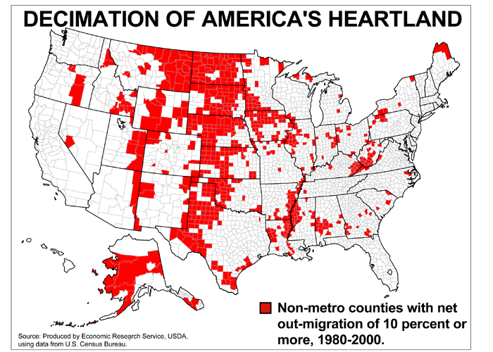
Some context is important. Note from the map below of US rural counties that lost population 1980-2000, that the Adirondack counties are not among these, with the exception of Clinton County, which lost due to the closing or the Airforce base there. Though some Adirondack towns lost population 2000-2010, these losses are far less than the gains made 1980-2000. Also, national context is important, as we see throughout this piece. Over half of all rural counties have seen dramatic population losses.
So, overall the Park’s population trends show a mixed bag and the best data we have about the changes in the 2000-2010 US Census shows a slight downward trend. We’ve seen how this trend fits with the rest of New York, where there are clearly areas doing better and areas doing worse. But more importantly we need to look at questions about how the Park’s slight downward trend fits with the rest of the US, especially the rural US.
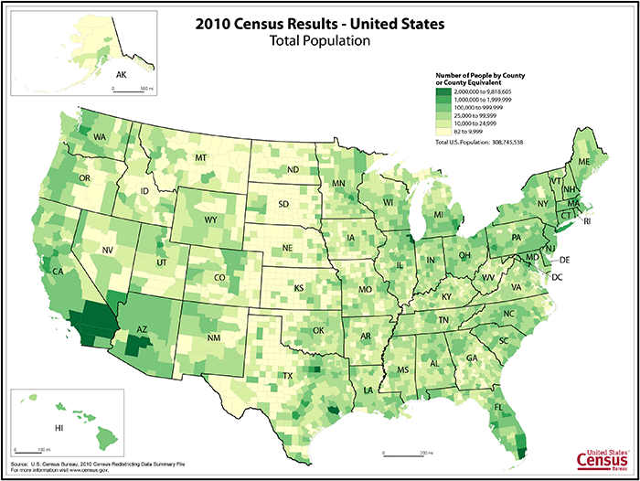
Lets start by looking at how population is dispersed through the US. This map is from the  2010 US Census and is organized by county.
On this map, the major population areas of Los Angeles-San Diego, Phoenix, Dallas-Fort Worth, Chicago, Miami, and New York City all stand out. The Adirondacks and much of upstate New York are more thinly populated at the 25,000-99,999 level with the exception of Hamilton County, which is under 9,999.
When we look across the country there are plenty of other counties with 9,999 people or less. There are a few scattered such counties in the northeast, but they pick up in number in Appalachia (western Pennsylvania through northern Mississippi), and the south, and then are abundant across the Great Plains and west. Whole regions of the US have Hamilton County-like population patterns; Michigan’s Upper Peninsula, eastern Montana, northwest Missouri, western Kansas, northwest Nebraska, central South Dakota, southwest Montana-central Idaho, west Texas.
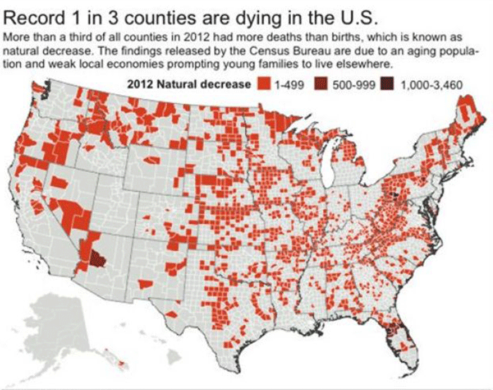
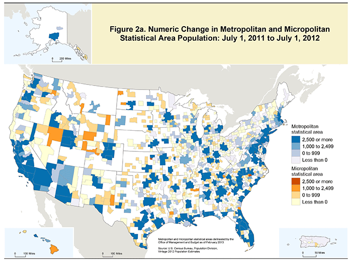
Here are two more maps of the US by county based on the US Census 2012 estimate. The first was produced by the US Census and shows areas estimated to have grown. Note that blue areas show levels of growth, yellow areas show flat populations, and white show loss. The second is basically a reverse (though with some discrepancies) produced by the Associated Press (with its own screaming headline) from the Census 2012 estimate that shows counties experiencing declines. The two together are useful because they provide a growth-loss contrast.
What do we see in these two maps? There’s a whole lot of white in the first map (or red in the AP map) that shows population losses. All of the large geographic rural areas mentioned above saw losses, with the exception of the Dakotas, which are likely seeing a population influx fueled by the hydro-fracking boom there. Across the Northern Forest areas of New York-Vermont-New Hampshire-Maine it’s all flat or loss. Outside of Fort Drum driving a population rise in Jefferson County, upstate New York is estimated to be flat or declining. Just as with trends in 2000-2010, the 2012 estimates sees continued growth in the Capitol District, greater Rochester area, and around New York City.
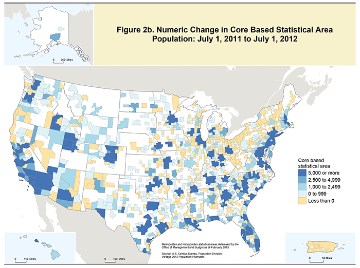
As we look at where growth is estimated to be occurring in 2012, it’s worth comparing two more maps of metropolitan and micropolitan areas. The first map shows these areas with the country’s highest populations (metropolitan and micropolitan) and the second map shows where growth was estimated in 2012.
Clearly, lots of major metropolitan areas are estimated as growing by the US Census. There’s also plenty of growth around small cities across the US.
And, there’s a whole lot of rural areas where the Census estimates no growth.
So, the question is, where are the positive examples in rural America that show population growth that may serve as a useful model and provide a path forward for the Adirondack Park?
Look at these maps for as long as you please, but there aren’t many areas that jump out as both rural and growing.

